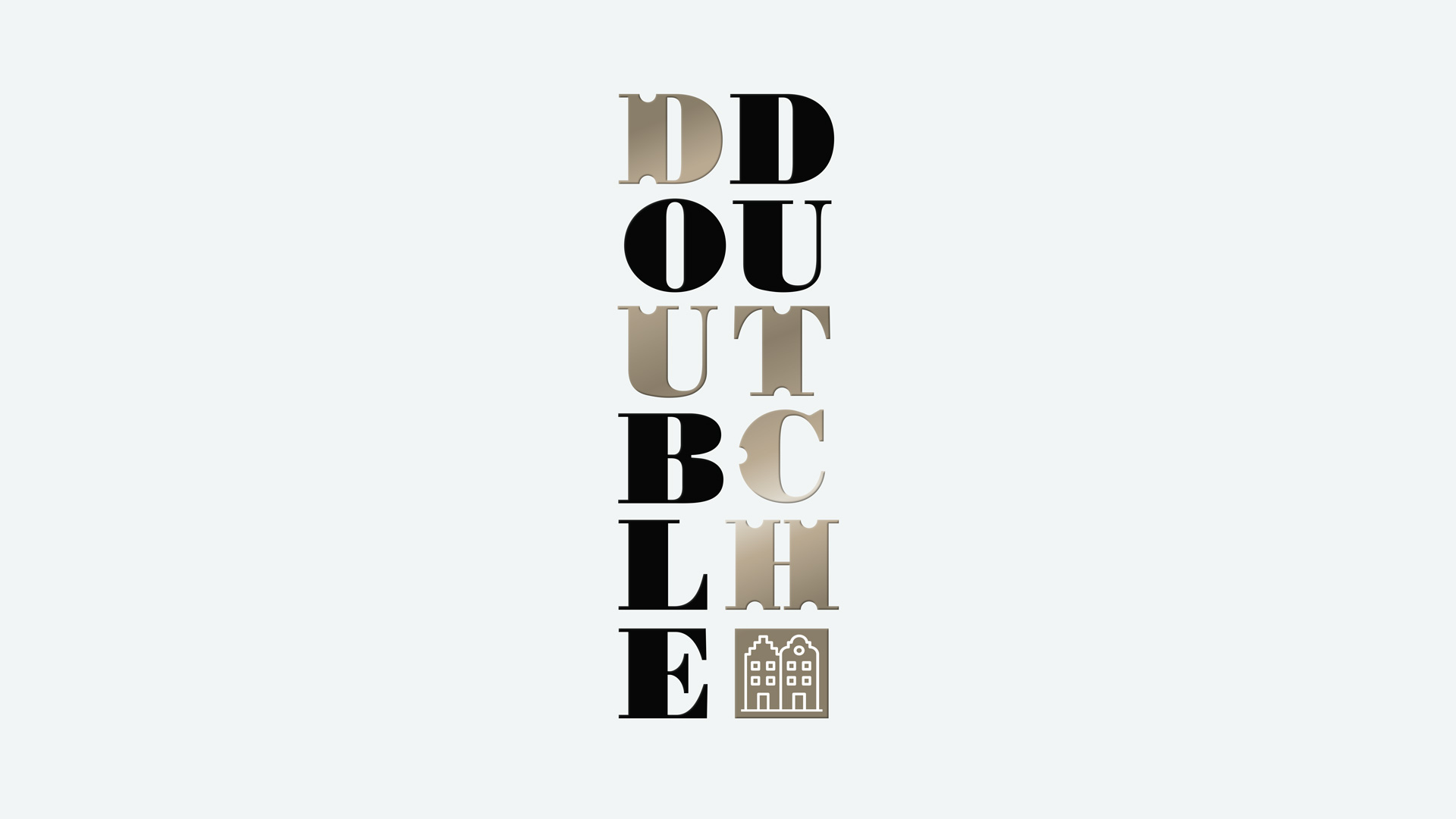

DOUBLE DUTCH was named in reference to the Dutch founders of this mixer brand, who are twin sisters. The sisters set about finding the perfect balance between soda and spirit, products that can be paired with spirits or savoured on their own. The brief was to design the brand identity and packaging for single serve bottles, currently being sold in Harvey Nicholls with the aim to sell to Waitrose, Harrods and a number of nightclubs. I considered the background of the twin sisters to be the most interesting aspect of the brand story, followed by its provenance in the Netherlands. The vertical brand marque evokes the tall town houses in Holland, also echoed with the twin houses in the insignia. The typography is also a nod to the meaning of the expression Double Dutch, appearing superficially non-sensical but easy to decode. The ingredients etching references the Dutch Golden Age of painting in the 17th Century.